I don't really care much for karma - I think it's measuring the wrong thing and encouraging sub-optimal behaviour, but I don't say too much about it, because I don't have a better suggestion.
Anyway, today I plotted a graph of my karma, just using Python to create a PGM file:
    #!/usr/bin/python

    size_x, size_y = 640, 480

    def get_data():
        p = {}
        h = file('karma.data')
        mx,my=-1,-1
        for l in h.xreadlines():
            fields = l.split()
            x,y = (int(fields[2]),int(fields[6]))
            if mx<x:mx=x
            if my<y:my=y
            p[(x,y)] = 1
        h.close()
        return mx,my,p

    handle = file('KarmaGraph.pgm','w')
    handle.write('P5\n%d %d\n255\n' % (size_x,size_y))
    mx,my,p = get_data()
    print 'Max x:',mx
    print 'Max y:',my
    remap = {}
    for (x,y) in p:
        remap[(x*(size_x-1)/mx,y*(size_y-1)/my)] = 1

    for gy in range(size_y,-1,-1):
        line = size_x*[0]
        for x,y in remap:
            if gy==y:
        line[x]=255
    handle.write(''.join([ chr(c) for c in line ]))
It's not great code, and I've removed some of the error checking, but it works well enough as a throw-away script.
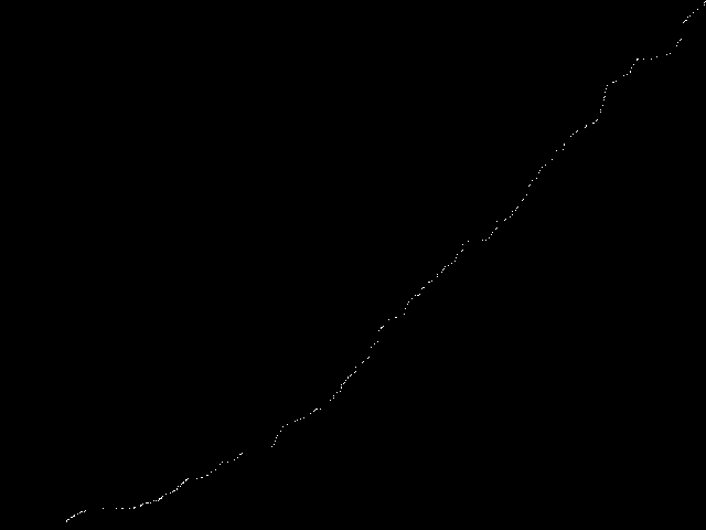
It produced this:
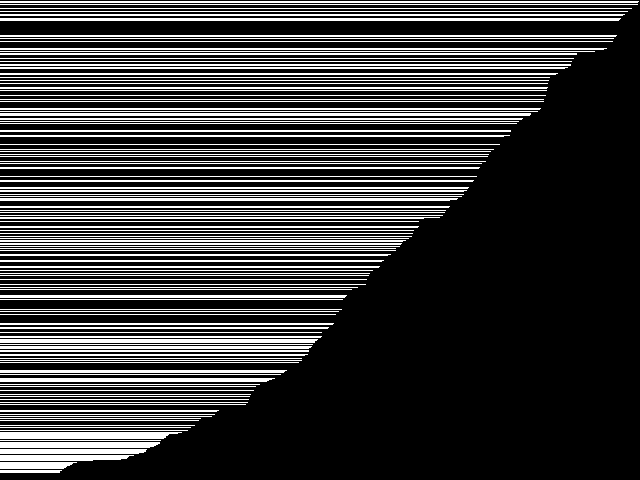
That's a little difficult to see the structure, so I changed the code, replacing this line:
line[x]=255
with this line:
line = x*[255] + (size_x-x)*[0]
which gave me this:
It's easier to see what's going on, but I thought I'd prefer a proper line graph. Usingthe Gimp I blurred the existing data:

And then flood-filled the area under the notational line:

Finally, some thresholding gave me the indication I wanted:
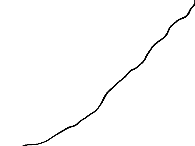
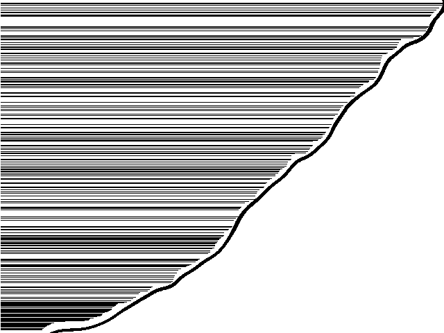
It's important to note that this is just for pretty visualisation. In particular, it's not especially accurate, as the line is shifted down/across from where it really should be:
But for my purposes, it'll do.